Introduction
We have developed a web server named LiverSC, which is user-friendly and aims to assist researchers in obtaining information from scRNA-seq data on liver cancer in a more straightforward and speedy way. LiverSC can perform most functional analyses related to scRNA-seq data, such as cell clustering, cell annotation, identification of differentially expressed genes, analysis of cellular crosstalk, and pseudo-time analysis, without coding. This intuitive interface allows users, particularly wet-lab researchers, to easily explore and share the data with their collaborators.
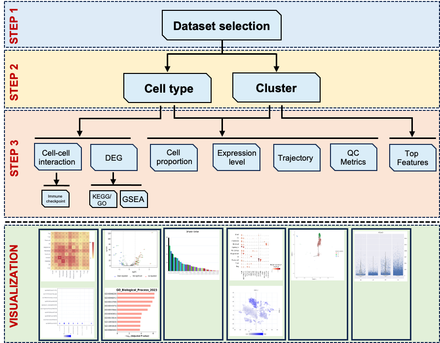
An overview of the workflow for LiverSCA.
Workflow
Dataset Selection and cellular landscape
All the subsequent analyses are based on the dataset selection. The datasets used in LiverSCA are from public and in-house sources. We annotated the major cell types in each dataset by using the markers reported in the original studies. We provided the phenotype here for the users selected. After phenotype selection, users can see the cellular landscape by TSEN or UMAP reduction method and the cell distribution can be presented by cell types or clusters.
As this dataset has multiple samples, users can look at a specific single sample as well as a self-defined combination through “Sample ID” selection. When users choose to display the cellular landscape by cell type, they can view the distribution of a specific cell type or various groups of cell types by selecting from the “Celltype list”. Similarly, users can also check the cell distribution according to clusters when users chose clusters to color the cellular landscape. Dataset selection and landscape are the first two requirement steps for the subsequent analysis (Figure 1).
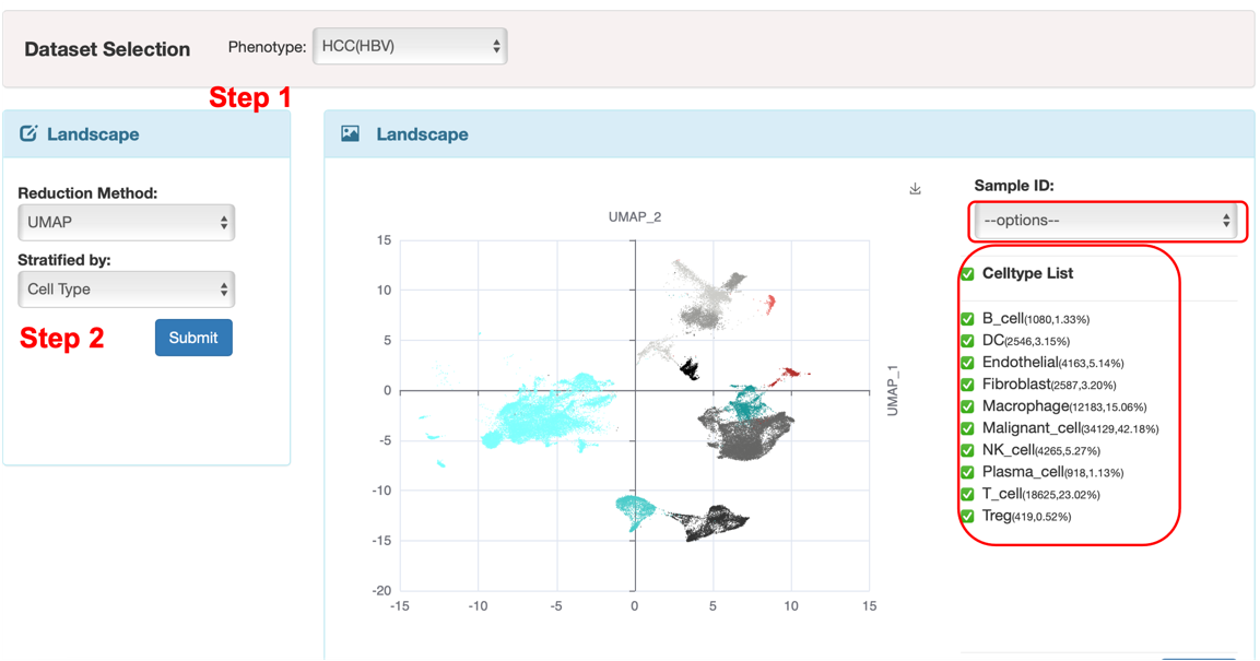
Figure 1. The interface of the first two basic steps.
Cell Proportion
In the cell proportion module, we offer two visualization methods (Figure 2). The first is a bar plot that displays the cell population of each cell type/cluster. The second is a box plot that illustrates the distribution of gene counts per cell for each cell type/cluster. It should be noted that the results displayed by cluster or cell type are in line with the annotation methods (either cell type or cluster) that were used to depict cellular landscape in previous step. Additionally, users can download these plots by clicking the download sign on the right top of the plots.
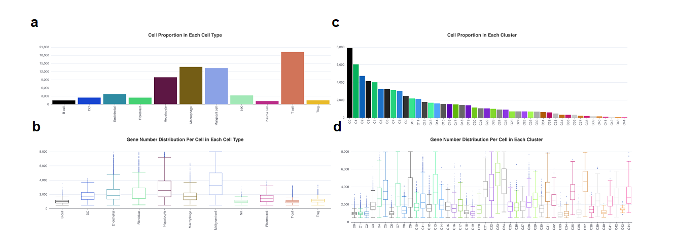
Figure 2. The cell proportion and feature count in each cell type/cluster. a. The bar plot showed the cell population in each cell type. b. The box plot showed the gene number in each cell type. c. The bar plot showed the cell population in each cell cluster. d. The box plot showed the gene number in each cluster. The x-axis in a and b means cell types, and in c and d means clusters. The y-axis in a and c means cell number, and in b and d means gene number.
Marker Genes
The functions of the Marker Genes module vary depending on the cellular landscape presented by different cell types or clusters. When selecting cell types for display, this module is capable of analyzing differently expressed genes (DEGs) (Figure 3a). Additionally, if users use clusters, it can reveal the most distinctive features of each cluster (Figure 3b).
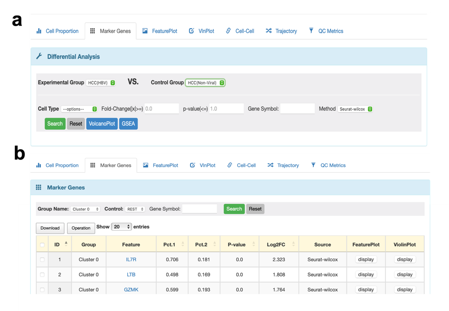
Figure 3. The changed functions of the Marker Genes module. a. When users chose cell types to present cellular landscape, the function of Marker Genes is to perform DEGs between different tissues. b. When users chose clusters to present cellular landscape, the Marker Genes module can show the top features in each cluster.
If users choose cell types in the previous step 2, they can conduct a DEGs analysis between phenotype. First of all, users should decide to find DEGs in which two groups. Please select the type of cell want to detect. If users don't provide a cutoff value for fold-change and p-value, the results will include all the features in the database with statistical results for DEGs. To examine the expression level of a specific gene in a particular cell type between two chosen tissues, users can type in the gene name using all uppercase letters in the “Gene Symbol” section. After finishing all options, DEGs will be presented in a table format, users can click the download option to get all or chosen results. We also offer a standard visualization method, known as the volcano plot, to display the results of DEGs. Here, we provide the default cutoff value of fold-change and the p-value is 2 and 0.05, respectively. We will also print the names of the top ten up/down-regulated DGEs. Additionally, users can perform GO and KEGG analysis for the up/down-regulated DEGs and the top 10 signatures will be shown in plots. Apart from that, gene set enrichment analysis (GSEA) with different reference databases is still accessible in this module. Users can click the “Download” option to get all results of the functional analysis. Here is a summary of the functions available in the Marker Genes module when choosing cell types (as shown in Figure 4).
If users select clusters in the previous step 2, they can check the expression levels of all genes in each cluster compared with the rest of all clusters. It is still available to examine the particular gene expression in each cluster, using the same method mentioned before.
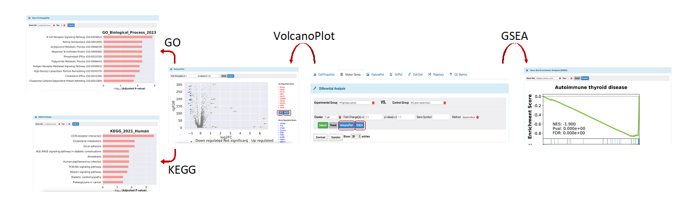
Figure 4. All functions in differential analysis.
FeaturePlot and VlnPlot modules
We provide two visualization approaches to examine the expression level of one gene or a set of genes. It's important to mention that the outcomes in these two modules will align with the choices made in the previous step 2. Furthermore, the Marker Gene module displays convenient links for all its features, which enable users to access their corresponding functions quickly. To illustrate, let's take the example of cell type.
In the FeaturePlot module, users can examine the expression levels of a single gene in a cellular landscape. This allows users to easily identify the specific cell type that exhibits a high level of corresponding gene expression. For the choice of gene, we offer two options (Figure 5a). The first is canonical markers which we used to annotate the cell types. When selecting this option, users should choose the cell type they are interested in. For each cell type, there are several markers available, but the user can only select one marker at a time. Another one is a user-defined marker. Users can input the name of any gene that are interested in, using all letters capitalization, to view its expression level.
In the Vlnplot module, users can use the same method mentioned in the FeaturePlot module (Figure 5c) to select genes. And the main difference between these two modules is that in the latter, users can check a set of genes at once, and the results will be presented using both a violin plot and a dot plot.
Users can utilize the comparison option within the SelectData function (Figure 5b), which displays the experimental groups corresponding to the initial phenotype selections, as well as a control group, allowing users to choose any group of interest. Ultimately, the expression of the selected marker is illustrated in two separate feature plots. In the VlnPlot section, a similar method to that in the FeaturePlot is employed for marker selection; however, this module permits the selection of additional markers simultaneously. The visualization results are presented as two independent violin plots and dot plots based on the selected phenotypes.
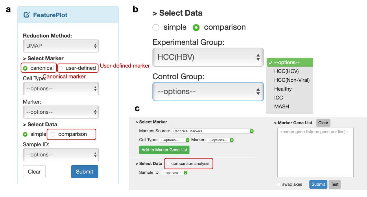
Figure 5. Two visualization methods to check the gene expression level. a. The options should be selected in FeaturePlot module. b. The options allowed to check expression in two groups. c. The interface of VlnPlot module.
Cell-cell module
To perform cell communication analysis, we utilize CellphoneDB and CellChat on our website. This module provides an overview heatmap of cellular crosstalk between different cell types. The numbers on the plot represent the significant count of interaction pairs. Moreover, a filter bar is available for the heatmap plot. To check all interaction pairs between two specific cell types, this module offers a function. Users need to select the cell types of partner A and partner B. For instance, when using CellphoneDB, we have opted for hepatocytes as partner A's cell type and T cells as partner B's cell type. If users do not provide any preferences, such as score or p-value, the outcome will display all the pairs available in the CellphoneDB database. Interaction pairs are classified into four types based on the role of the cell type (whether it contributes as a ligand or receptor). If you want to select the types that interest you, you can use the "Receptor(A|B)" option. Please note that "+" indicates receptor and "-" indicates ligand. To analyze the interaction between hepatocytes and T cells where hepatocytes contribute receptors and T cells contribute ligands, select partner A as hepatocytes and partner B as T cells in the "Receptor(A|B)" option with "(+/-)" setting. For comprehensive analysis of all pairs where hepatocytes offer receptors and communicate with T cells, select T cells as partner A and hepatocytes as partner B in the "Receptor(A|B)" option with "(-/+)" setting. The interaction scores and statistical values will be based on their expression levels in our database. Kindly take note that the current selection (partner A as hepatocytes and partner B as T cells) solely exhibits the interaction pairs involving hepatocytes and T cells. If users would like to view the pairs involving T cells and hepatocytes and shown in the same outcome, ensure that you select the "including partner swapped" option. When both components in an interaction are simple, you can quickly check their expression level in the corresponding cell type by clicking on the "Expression level" column. Users can click the “DotPlot” option to visualize the interaction pairs in different cell type pairs. Similarly, cell type of partner A and B should be selected and can click the “Add” option to add more celltype pairs. And the option “Number” means the number of pairs used to plot the figure, which is filtered by the interaction score regardless of the significant value. So 10 in the “Number” option indicates the top 10 pairs with high interaction scores with or without significant p-value. Besides, users also can depict the dot plot using certain interaction pairs which can be input from the “Interaction Proteins(A|B)” option.
For users who are interested in immune checkpoint pairs, they can simply select the “Immune-Checkpoint” option. This section contains all the functions mentioned in the general pairs but specifically focuses on the immune checkpoint pairs between antigen-presented cells (APC) and T cells. In addition, we provide a limited database containing some well-known immune checkpoint pairs that have been reported in public papers.
Trajectory module
Although there are no multiple subtypes in this dataset, we provide pseudo-time inference analysis. Users have the option to choose a specific cell type and examine its developmental progressions organized by clusters or subtypes (if applicable). The results are presented through four plots one is umap plot colored by predicted cell state, while the other three are displayed through pseudo-time. With both outcomes combined, users can easily deduce the cell state.
QC Metrics module
In this module, users can verify the quality of the scRNA-seq data. Here, we show the data information from three parameters: the number of unique genes detected in each cell (nFeature_RNA), the total number of molecules detected in a cell (nCount_RNA) and the percentage of reads that map to the mitochondrial genome (percentage_MT). The results are shown by the violin plot as well as the bar plot. Users can click “Group by” selection to decide to show the results whether by sample or phenotype/tissue. When users select sample, it will display all sample IDs, can click “check All” to show all sample information from that three parameters one by one. If users prefer to view all sample information in a single plot, can click “ horizontal stack” option. For this module, we recommend that users select “phenotype” in the “Group by” option. This will combine the samples according to the various tissues.
Cautions and limitations
Before using this website, please review the following information carefully to ensure an unbiased and accurate workflow. Please be noted that LiverSCA has certain limitations, and users should pay particular attention to the following key points: The HCC and ICC datasets were collected from both public and inhouse sources and encompass nearly all cell types. However, the MASLD/MASH dataset includes nonmalignant cases and is restricted to immune cells only. We utilized Harmony for data integration, which proved to be effective in eliminating batch effects as compared to other methods. Consequently, all datasets have been processed to remove batch biases. Moreover, we offer a pseudo-time inference analysis module. Users can take advantage of this function to examine developmental progressions organized by cell clusters.
To sum up, our website tool of scRNA-seq analysis pipeline offers a complete set of functions to investigate cellular landscape and gene expression patterns in intricate biological systems of HCC. It is user-friendly and adaptable, enabling users to customize their analysis to their research inquiries and dataset features. Our interface tool is designed to assist lab researchers in discovering new understandings of the mechanisms behind complex biological processes through the use of bioinformatic methods. We aim to make this process easier and more efficient for researchers.